Empowering your Finances
We partnered with Capify to craft a bold new brand identity for their next phase of growth as a B2B financial technology provider.
Through strategic messaging, visual clarity, and a confident brand system, we helped Capify position itself as a trusted infrastructure partner for modern businesses. From logo and typography to real-world applications like sales collateral, digital assets, every element was designed to communicate stability, innovation, and professionalism.
Our work gave Capify the clarity and cohesion it needed to scale – aligning their internal team, client-facing assets, and enterprise partnerships under one powerful brand story.
Brand Strategy
Verbal Identity
Visual Identity
Brand Support
With Capify’s mission to simplify and empower modern finance, our goal was to build a brand system that matched their product’s clarity, power, and trustworthiness. From strategic messaging to visual language, every asset was crafted to reflect confidence and forward motion in a complex B2B financial landscape.
Through bold typography, structured design cues, and a refined tone of voice, we helped position Capify as more than just a fintech tool. The brand now presents Capify as a reliable growth partner in an industry where trust is critical, while remaining approachable to both emerging businesses and enterprise clients alike.
Capify’s verbal identity is built on clarity, confidence, and professionalism. The brand voice is designed to speak directly to finance teams, founders, and decision-makers seeking tools that are both powerful and approachable. By maintaining a tone that is precise yet human, Capify builds trust while remaining relatable across business touchpoints.
Every message is crafted to reinforce Capify’s role as a dependable B2B partner in an industry where trust is everything. The language is clear and intentional, balancing financial authority with accessibility. This voice reflects Capify’s commitment to empowering modern businesses with the tools they need to grow, scale, and thrive in a fast-moving financial landscape.
Capify’s verbal identity is built to bring structure and confidence to B2B financial communication. In an industry often filled with jargon, the voice is clear, concise, and grounded. It communicates with intent and precision, helping complex ideas land simply and effectively.
The tone is professional but never rigid. It speaks to business leaders, operators, and finance teams who value clarity and accountability. Every word is chosen to reflect Capify’s role as a dependable growth partner in a high-stakes space.
Rather than overselling innovation, Capify builds trust through clarity and control. Whether in a sales email, investor deck, or product page, the language is measured, intelligent, and aligned with the real needs of modern B2B customers.
To create a distinct and scalable identity for Capify, we designed a custom wordmark that balances approachability with financial authority. The softened lowercase forms reflect clarity and openness, while the subtle upward motion in the letterforms hints at momentum and growth.
The mark is deliberately simple, making it adaptable across high-visibility touchpoints like dashboards, investor decks, and branded communications. Its geometric precision gives it a modern, trustworthy feel that speaks to both early-stage teams and enterprise buyers.
Capify’s logo is not just a name. It is a visual expression of the brand’s promise to simplify complex financial systems and become a steady, confident partner in a rapidly evolving space.
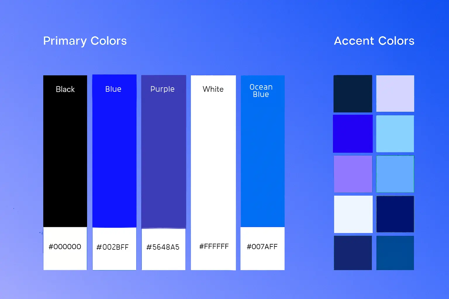
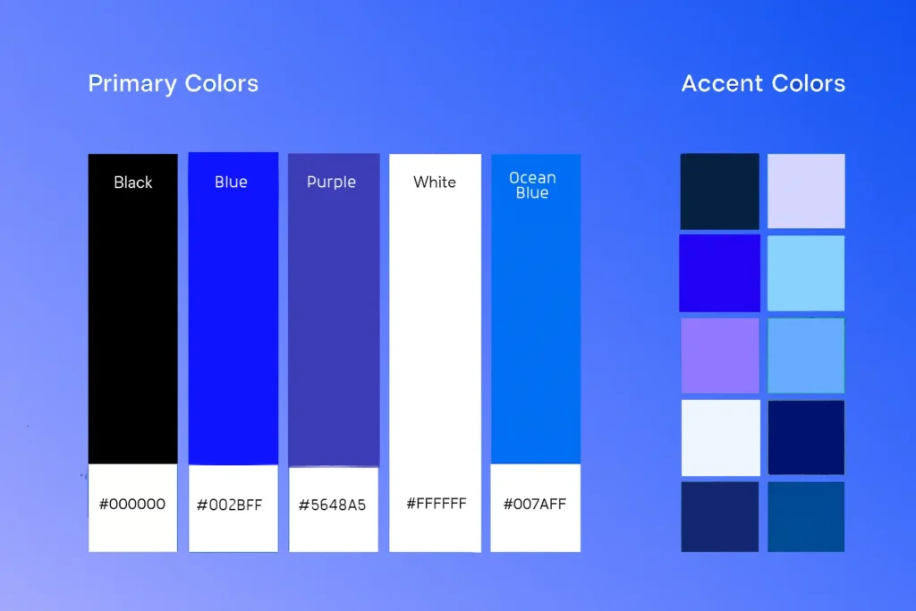
Capify’s visual language is designed to reflect confidence, clarity, and momentum. The brand leans into a refined yet energetic aesthetic that resonates with B2B audiences who value both trust and innovation. The color palette uses deep blues with clean gradients to create a sense of professionalism and forward motion.
Typography, layout, and spatial rhythm are built with intention – every element is designed to feel precise, modern, and easy to navigate across digital platforms, pitch decks, and internal tools. The visual system is flexible enough for growth, while maintaining the consistency needed to build long-term brand equity.
In every touchpoint, Capify’s visual expression reinforces its identity as a modern fintech partner – signaling a brand that is ready to support teams, scale with complexity, and lead with clarity.
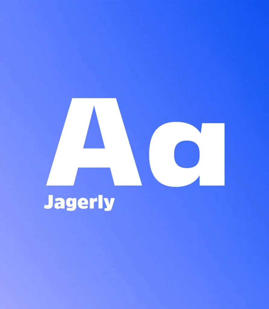
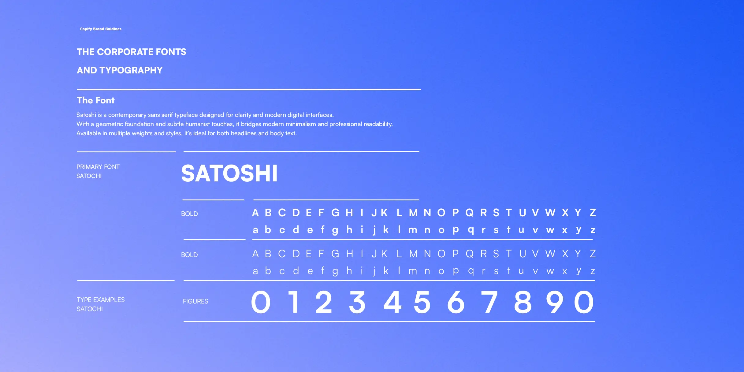
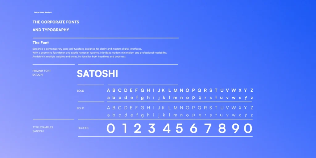
Typography: Capify’s typography system balances clarity with confidence. The primary typeface is modern and structured – chosen for its readability and ability to convey trust at a glance. It performs well across digital interfaces, pitch decks, and product environments where clarity is critical.
A secondary typeface introduces subtle warmth and contrast, adding a human touch to marketing materials without sacrificing precision. The combination creates a visual rhythm that supports Capify’s core message – clear tools, smart finance, built for growth.
Our work with Capify created a bold and cohesive brand experience, enhancing their presence in the competitive fintech landscape. By aligning Capify’s mission with strategic messaging, intuitive design, and a dynamic digital presence, we helped position them as a modern financial partner for growing businesses.
From refining their brand foundation to developing a sleek, user-focused interface, our efforts positioned Capify as a trusted enabler of smarter financial decisions. This evolved identity gave small and medium-sized businesses greater clarity and confidence in managing their finances, empowering them to track cash flow, plan growth, and access capital, all from a single, powerful platform.
With a consistent brand story and seamless user experience, Capify’s new identity now serves as a beacon of financial clarity and business empowerment. It unites clients on a shared path toward smarter and stronger growth.
Jordan Levy
CEO
“Snapp came in with a deep understanding of what B2B brands like ours need – structure, clarity, and momentum. From day one, they helped us rethink how we present ourselves to both customers and investors. Their work across brand strategy, messaging, identity, and rollout brought a level of consistency we simply didn’t have before.
The process felt focused and collaborative at every step. What we walked away with was more than just a visual upgrade – it was a system that actually supports how we grow, scale, and communicate in a complex space.”
+ Avg. 56s
View duration
93%
View rate
1.4 milion
Views on Youtube
Next Project
Munch - AI video repurposing platform
Empowering your Finances
Clarity, Confidence, Capify
We partnered with Capify to craft a bold new brand identity for their next phase of growth as a B2B financial technology provider.
Through strategic messaging, visual clarity, and a confident brand system, we helped Capify position itself as a trusted infrastructure partner for modern businesses. From logo and typography to real-world applications like sales collateral, digital assets, every element was designed to communicate stability, innovation, and professionalism.
Our work gave Capify the clarity and cohesion it needed to scale – aligning their internal team, client-facing assets, and enterprise partnerships under one powerful brand story.
Brand Strategy
Verbal Identity
Visual Identity
Brand Support
Clarity, Confidence, Capify
With Capify’s mission to simplify and empower modern finance, our goal was to build a brand system that matched their product’s clarity, power, and trustworthiness. From strategic messaging to visual language, every asset was crafted to reflect confidence and forward motion in a complex B2B financial landscape.
Through bold typography, structured design cues, and a refined tone of voice, we helped position Capify as more than just a fintech tool. The brand now presents Capify as a reliable growth partner in an industry where trust is critical, while remaining approachable to both emerging businesses and enterprise clients alike.
Brand Strategy
Capify’s verbal identity is built on clarity, confidence, and professionalism. The brand voice is designed to speak directly to finance teams, founders, and decision-makers seeking tools that are both powerful and approachable. By maintaining a tone that is precise yet human, Capify builds trust while remaining relatable across business touchpoints.
Every message is crafted to reinforce Capify’s role as a dependable B2B partner in an industry where trust is everything. The language is clear and intentional, balancing financial authority with accessibility. This voice reflects Capify’s commitment to empowering modern businesses with the tools they need to grow, scale, and thrive in a fast-moving financial landscape.
Verbal Identity
Capify’s verbal identity is built to bring structure and confidence to B2B financial communication. In an industry often filled with jargon, the voice is clear, concise, and grounded. It communicates with intent and precision, helping complex ideas land simply and effectively.
The tone is professional but never rigid. It speaks to business leaders, operators, and finance teams who value clarity and accountability. Every word is chosen to reflect Capify’s role as a dependable growth partner in a high-stakes space.
Rather than overselling innovation, Capify builds trust through clarity and control. Whether in a sales email, investor deck, or product page, the language is measured, intelligent, and aligned with the real needs of modern B2B customers.
Logo
To create a distinct and scalable identity for Capify, we designed a custom wordmark that balances approachability with financial authority. The softened lowercase forms reflect clarity and openness, while the subtle upward motion in the letterforms hints at momentum and growth.
The mark is deliberately simple, making it adaptable across high-visibility touchpoints like dashboards, investor decks, and branded communications. Its geometric precision gives it a modern, trustworthy feel that speaks to both early-stage teams and enterprise buyers.
Capify’s logo is not just a name. It is a visual expression of the brand’s promise to simplify complex financial systems and become a steady, confident partner in a rapidly evolving space.
Visual Language
Capify’s visual language is designed to reflect confidence, clarity, and momentum. The brand leans into a refined yet energetic aesthetic that resonates with B2B audiences who value both trust and innovation. The color palette uses deep blues with clean gradients to create a sense of professionalism and forward motion.
Typography, layout, and spatial rhythm are built with intention – every element is designed to feel precise, modern, and easy to navigate across digital platforms, pitch decks, and internal tools. The visual system is flexible enough for growth, while maintaining the consistency needed to build long-term brand equity.
In every touchpoint, Capify’s visual expression reinforces its identity as a modern fintech partner – signaling a brand that is ready to support teams, scale with complexity, and lead with clarity.
Typography
Typography: Capify’s typography system balances clarity with confidence. The primary typeface is modern and structured – chosen for its readability and ability to convey trust at a glance. It performs well across digital interfaces, pitch decks, and product environments where clarity is critical.
A secondary typeface introduces subtle warmth and contrast, adding a human touch to marketing materials without sacrificing precision. The combination creates a visual rhythm that supports Capify’s core message – clear tools, smart finance, built for growth.
The Results
Our work with Capify created a bold and cohesive brand experience, enhancing their presence in the competitive fintech landscape. By aligning Capify’s mission with strategic messaging, intuitive design, and a dynamic digital presence, we helped position them as a modern financial partner for growing businesses.
From refining their brand foundation to developing a sleek, user-focused interface, our efforts positioned Capify as a trusted enabler of smarter financial decisions. This evolved identity gave small and medium-sized businesses greater clarity and confidence in managing their finances, empowering them to track cash flow, plan growth, and access capital, all from a single, powerful platform.
With a consistent brand story and seamless user experience, Capify’s new identity now serves as a beacon of financial clarity and business empowerment. It unites clients on a shared path toward smarter and stronger growth.

Jordan Levy
CEO
“Snapp came in with a deep understanding of what B2B brands like ours need – structure, clarity, and momentum. From day one, they helped us rethink how we present ourselves to both customers and investors. Their work across brand strategy, messaging, identity, and rollout brought a level of consistency we simply didn’t have before.
The process felt focused and collaborative at every step. What we walked away with was more than just a visual upgrade – it was a system that actually supports how we grow, scale, and communicate in a complex space.”
+ Avg. 56s
View duration
93%
View rate
1.4 milion
Views on Youtube