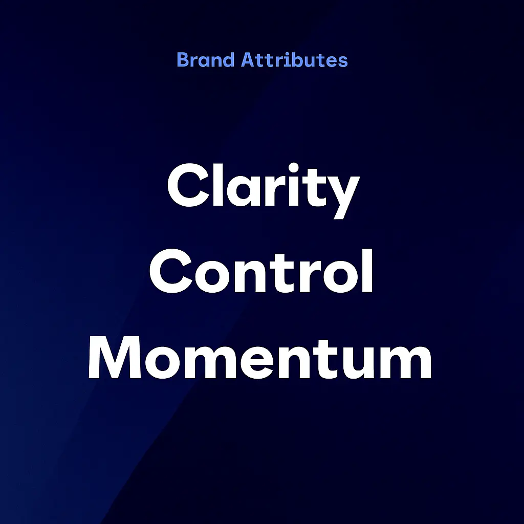
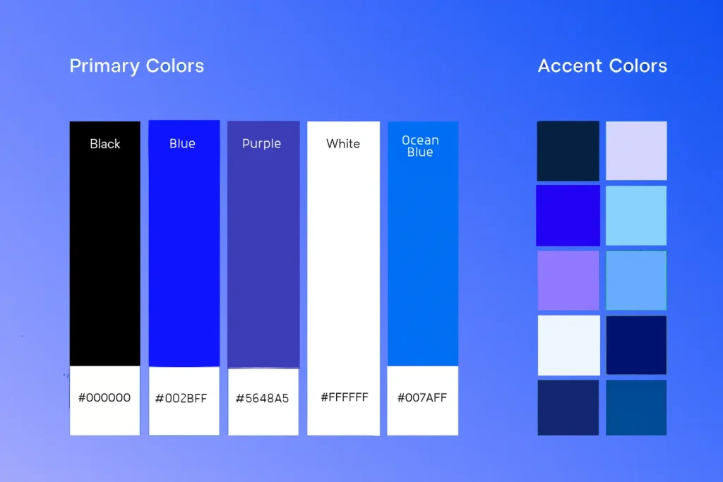
Zamza’s visual language is designed to feel calm, intentional, and quietly powerful. Instead of overwhelming with noise, the system uses soft purples, spacious layouts, and fluid forms to create an atmosphere of clarity and support.
Typography, color, and shape language are applied with purpose – every element invites ease, openness, and possibility. The system flexes across presentations, websites, and social content while maintaining coherence, ensuring the brand always feels like a quiet guide.
At every touchpoint, Zamza’s visual identity reinforces its role as more than a marketplace: it’s a space for growth, connection, and becoming.
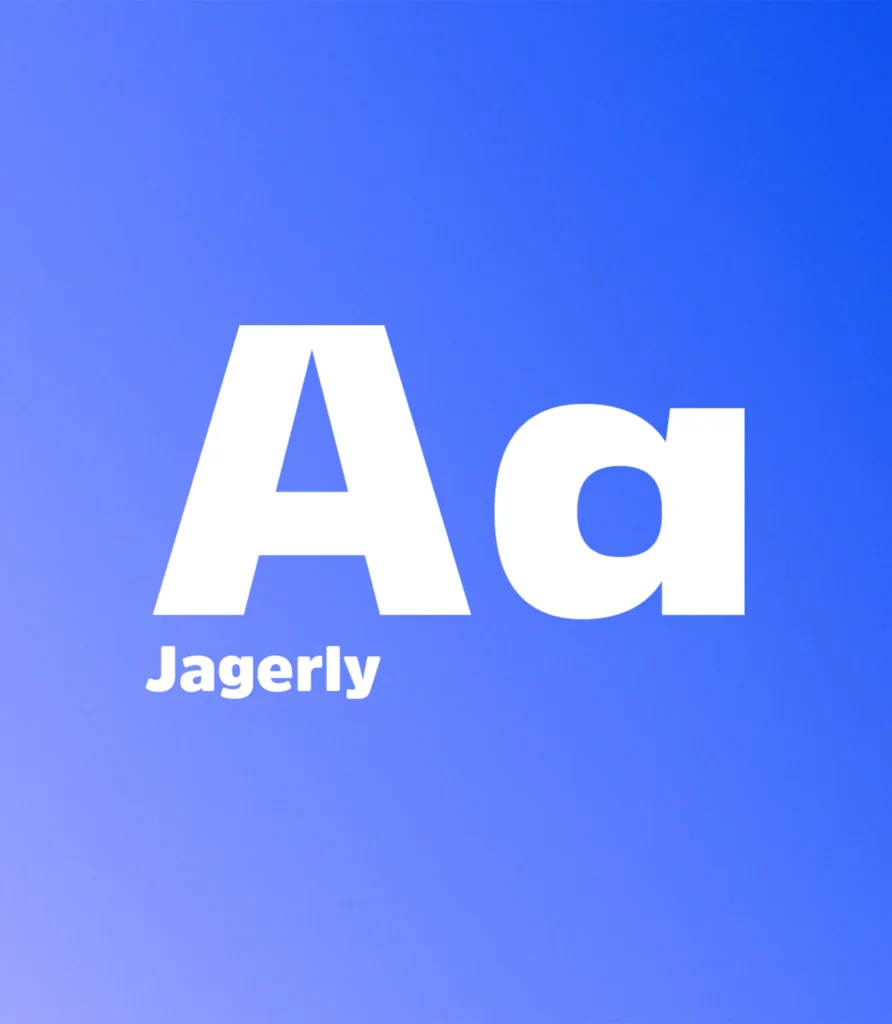
Typography:
Zamza’s typography system balances warmth with structure. The primary typeface, General Sans, is soft and human – chosen to communicate confidence without being loud. It works across headlines, brand statements, and key moments where the voice of the brand needs to feel clear and grounded.
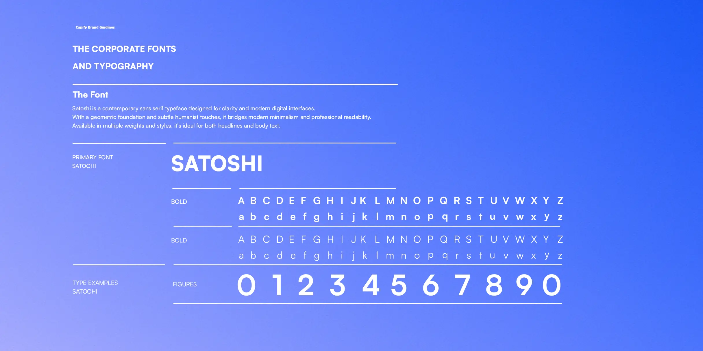
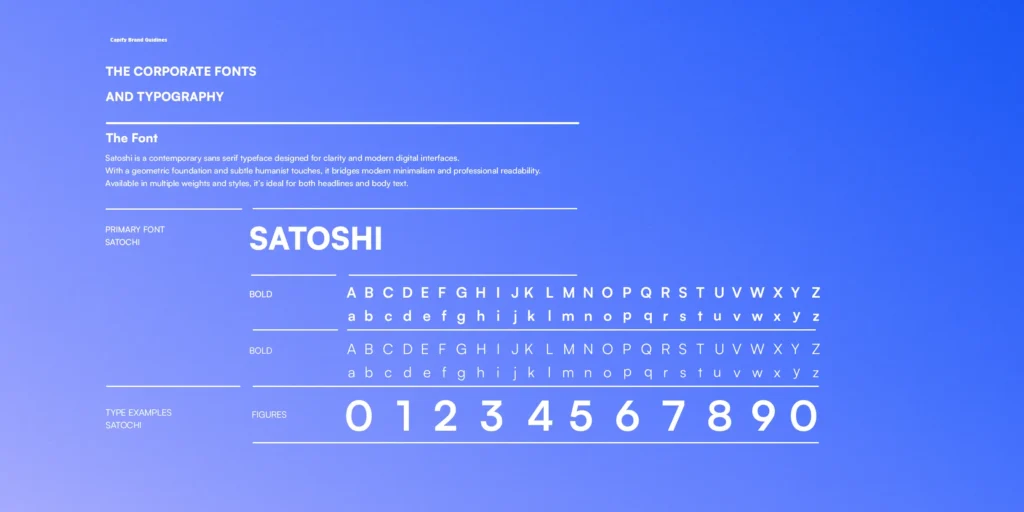
The secondary typeface, Satoshi, introduces balance and readability. Clean and minimal, it supports body copy, UI elements, and detailed layouts, ensuring clarity at every scale. Together, the pairing creates a rhythm that reflects Zamza’s brand: supportive, calm, and transformational.
A secondary typeface introduces subtle warmth and contrast, adding a human touch to marketing materials without sacrificing precision. The combination creates a visual rhythm that supports Capify’s core message – clear tools, smart finance, built for growth.